
Warsh's Week Ahead checklist
House and Senate testimonies… on tap this week

FOMC meeting—Check
Policy statement—Check
Press conference—Check
Minutes- Check
House and Senate testimonies… on tap this week
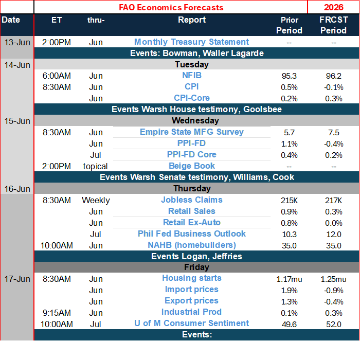
This week Kevin Warsh will continue to move through the progression of his responsibilities as Fed chair, touching new bases as he goes this week. He successfully completed his first FOMC meeting, getting a policy statement approved without any dissent. He successfully concluded his press conference after the policy statement was released and subsequently the minutes to the Fed’s policy meeting have been released, and there has been a chance for markets to digest what they are and what they mean. And, in the week ahead, he testifies before the House and Senate financial committees; those will be the Senate Banking Committee on the House Financial Services Committee. These meetings were initially set up under enabling legislation called the Humphrey Hawkins legislation, and sometimes these testimonies are still referred to under that rubric, although that legislation is no longer operative.
The point is that the chair will testify before each of these committees, and members will have an opportunity to ask him questions and refer to this as a significant part of the oversight that Congress has over the Fed. However, when you have a large committee and each committee member gets to ask some questions and they have an opportunity to ask questions for maybe 5 minutes apiece, there’s not much opportunity to really pursue any particular topic. These testimonies are really more of a dog and pony show that is in the interests of Congress so that the various members can be seen either praising or confronting the Fed chairman on behalf of their constituents.
And it’s not clear how much oversight these committees do beyond these particular testimonies. To prepare for these testimonies, the Fed issues reports on its policy so that there is a substantial written record that the Fed provides explaining what it has done. In the past there have been two of these testimonies every year; there’s one in either late January or early February and then another one around mid-July or later. However, this year there was no earlier meeting, and so it would appear that there will be only one of these testimonies this year occurring in July, although it’s possible that for whatever reason the Fed might schedule another one. It’s not clear to me whether the Fed cancelled or postponed the first of these testimonies because of the existing acrimony between the president and the Fed chair and all of the hoopla surrounding that confrontation. The monetary policy report for 2026 can be found on the Fed’s website (here).
The Fed report features as exhibit #1 a chart showing the trimed mean inflation rate (below)
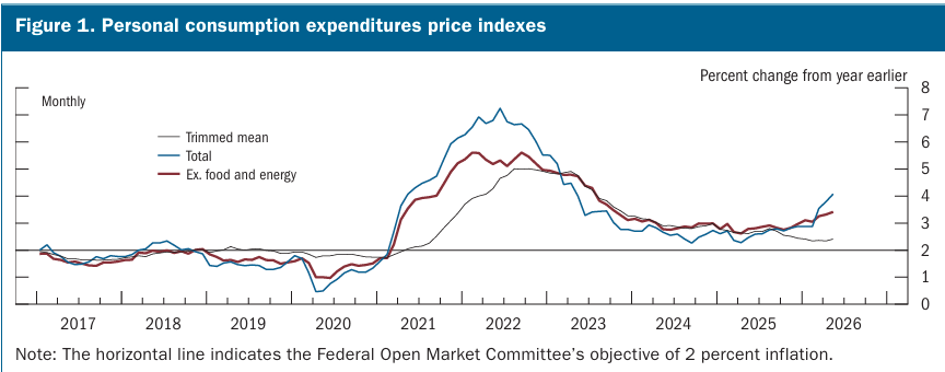
Some economists love the trimmed mean inflation gauge; however, it has been subject to rigorous academic investigation and found to be somewhat biased because of its construction. One of my problems with it is that eliminating the extremes of inflation, we’re not really sure that it is evenly eliminating things on the top side and on the bottom side, and in fact, when inflation is flaring, it’s going to be eliminating a lot more large increases, and when inflation is decelerating, it’s going to be eliminating a lot more declining items, and I’m not really sure that this is a reasonable or a fair way to do it even though economists will, on their own, given different inflation reports, talk about what particular outliers have done to the inflation metric that particular month. It’s natural to try to look at something that seems to be distorted and to isolate its impacts on the inflation rate but over time, given the way monetary policy works, all of the price increases, big, small, whatever, they all go into determining how the economy reacts. Trying to subtract an outlying component without subtracting the other influences it has on other prices and on other aspects of the economy strikes me as not being fair or wise.
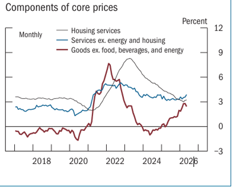
This is part of what the Fed report lists as figure 2 and on it you can see several trends that have been cited by economists The Fed has liked to emphasize the red series which shows that since tariffs were imposed the goods inflation rate has moved up relatively sharply. The purpose of this is to make the point that this is a one-time sort of move and that when the tariff inflation rate moves through the system, inflation will go back down to where it was… in some sense. However, you can also look at the blue series here, which is the core services inflation rate, and I think what’s more telling is the fact that before 2021 the core inflation rate was running at below 3%, and afterward it’s been running above 3% and while it has deflated slightly, it looks like it stopped falling, and core services are running at a pace above 3% and we’re not really sure what goods inflation is going to do. Housing inflation has been another favorite of market participants, arguing that it was artificially boosted partly because of the high mortgage rates and energy costs and the high costs of renting. However, it looks like the decline in housing cost inflation may have run its course and that that’s no longer going to be a positive moving forward. All of these analytical devices are meant to help the Fed understand what monetary policy needs to do and help it understand what inflation has been and what inflation is going to do in the future to better guide monetary policy. As you can see, I’m looking at these different series. Depending on how much you want to embrace one view or another, you can tell yourself some different positive or negative stories about what’s going on with the inflation picture. Because of this stubbornness of the blue series, I don’t understand the view that inflation, if left alone, is going back down to 2% it just doesn’t make any sense to me.
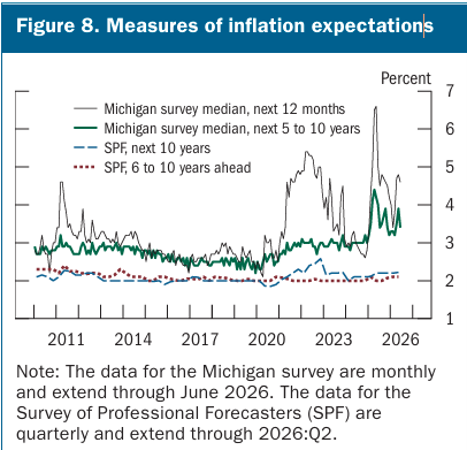
This next chart is a favorite of mine; it shows the University of Michigan survey for inflation expectations using the median for the next 12 months and the median for the next 5 to 10 years. If you’re interested, you can go to the University of Michigan site or download the data, and you can look and see how much worse things are if we look at the mean inflation rates from the Michigan survey. They are actually eye-popping numbers. And the Michigan survey has been one that’s been around for a long time and is one that could be considered a venerated series until the past several years when it began to produce such incredibly high inflation expectations numbers that the Fed has not wanted to refer to them or deal with them and has done everything It can to convince you not to look at them.
On the other hand, the chart delivers the survey of professional forecasters’ expectations marked as SPE, and on the chart you can see that a survey of professional forecasters has stayed pretty close to 2% except for a brief period when inflation really dramatically flared in the wake of COVID. The problem that I have with the survey of professional forecasters is that these are economists who tend to revere the Fed and have a very hard time making forecasts that assume that the Fed is not going to do its job. The Fed has in fact missed its 2% inflation target for five years running, and that appears to have had almost no impact whatsoever on what the survey of professional forecasters expect because they wholeheartedly expect that the Fed is going to do what it’s supposed to do and bring inflation back down to target. I prefer the University of Michigan survey much more for the simple fact that these are not professional forecasters, but they are looking at the data that’s being generated by the inflation reports, and they’re judging the Fed by what it’s done and by the credibility that it seems to deserve because of what it’s done rather than because they have studied economics and they have faith in the Fed and they know what the Fed is supposed to do. This is a big problem with market participants because I think it leads to a certain amount of denial in their pricing. And I think it leads to the kinds of results that we see from catastrophe theory where they remain in denial and prices remain stickier longer than they should until they realize something has gone wrong and then all of a sudden expectations shift.
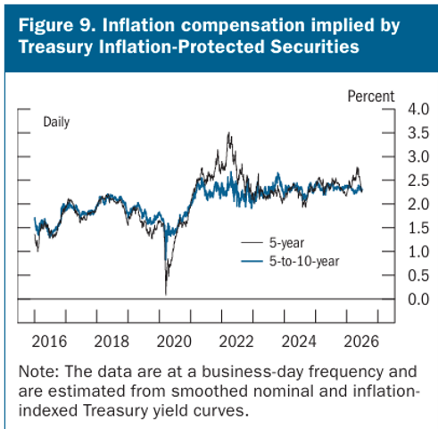
Subject to, I think, the same criticism, you can see the pricing that we get using Treasury Inflation-Protected Securities, so-called TIPS, and the spreads they have with ordinary Treasuries in order to try to extract an inflation expectation. The chart below it’s used to extract expectations over five years compared to 5 to 10 years. Looking at this chart, you’re probably prone to see that the inflation expectations aren’t very far above 2% which is what the Fed wants you to see and it assumes that this means that expectations are still anchored. However, there is a slight uptrend to these expectations, and what I would like to do is to have you compare it to the period prior to 2020 and see how much lower inflation expectations used to be when they were truly stable. Market participants pricing securities in this fashion have a hard time pushing their expectations far above the 2% mark except when they’re faced with extraordinary circumstances, as they were in 2021 and early 2022, and there you see the five-year head expectations did flare for a while, and then they came back down. But again, these are market participants, and their livelihoods almost completely require that they have faith in the Fed to keep market pricing on track.
The Fed’s presentation also looks at a number of unemployment rate calculations looking at unemployment overall by race and ethnicity and by sex and educational attainment. All of these measures show relatively low rates of unemployment and especially low by historic experience—the charts don’t go back very far to give you much history. Another chart that’s marked as figure B shows the employment population ratio, which is falling because of the aging population and, of course, because of the border being shut.
The Fed supplies charts showing a number of real wage measures, making the point that wages have been depressed when inflation surged during COVID and real wages have since rebounded, although the rate of change in real wages, while still positive, is being eroded. And, of course, the related concept is labor force participation, where it shows how in the wake of COVID, participation rates fell quite substantially, and they had a small rebound, but now they are eroding from these much lower levels.
The Fed has two more labor market charts, one of which shows how contained layoffs have been as well as jobless claims, and the other shows how a comparison of available jobs with available workers indicates an extremely tight labor market as the number of available workers is very close to the number of available jobs.
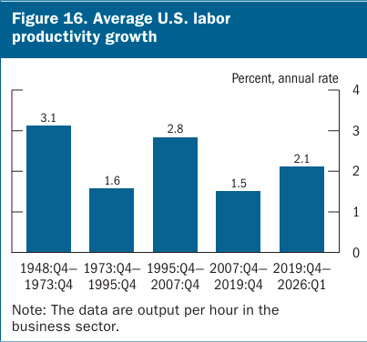
The Fed’s bar chart on productivity is a sort of stylized affair, and I describe it that way because the productivity results that you get and display on the chart are largely a function of the time periods that you pick, so you can pick the time periods to create—really—whatever message you’re trying to give. One of the reasons that I don’t really care for these kinds of bar charts is because they create these artificial periods unless you’ve got some really strong case for saying you need to look at this period versus that one and define them clearly; exhibiting bars like this doesn’t really convey any objective information.
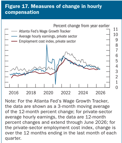
This chart argues that wage inflation, or hourly compensation, is roughly consistent with 2% inflation, and it may be true, but once again, if you look at this chart what you notice is the positions of the various lines before 2020 and how much lower they were then. Over the last year or two these series have flattened out and are no longer showing deceleration as being that prevalent. So, is this really that consistent with 2% or is this a story the Fed is trying to tell us? Another story we should be aware of is that not all inflation stems from a wage price spiral. You might remember that all ‘inflation is a monetary phenomenon’ so that would make us wonder why we’d be looking at the labor market to try to understand what inflation is going to be in the period ahead.
The next charts in the Fed’s presentation I’m going to skip over; they’re mostly an assortment of various macroeconomic charts showing how orders are strong and how consumer spending has been fine and the mortgage rates are historically high and that sort of thing…
Following the macro data, there’s a section that looks at federal receipts and expenditures as a percent of GDP as well as growing interest outlays as a percent of GDP.
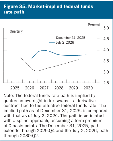
Another chart on the expected fed funds rate shows how the path for the expected fed funds rate has shifted up sharply as of July 2026 compared to the end of year 2025—see below:
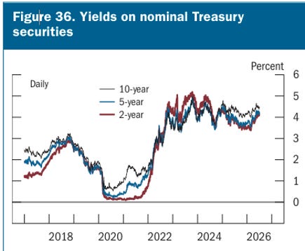
And the upward shift in Fed funds is not alone…
Another series of charts that I won’t believe dwells on looks at various measures of credit extended by banks and bank profitability as well as stock market performance. There are also charts looking at the performance of inflation abroad and the uptrend in inflation that is being experienced by other central banks. These charts include some expectations of foreign interest rates, which show up trends in place, and also trends in current interest rates and equity indices and other countries, most of which have been trending higher.
On page 37 of the presentation, the Fed begins to look at monetary policy directly.
This includes an assessment of interest rate policy and various descriptive charts on the composition of assets in the Fed’s balance sheet.
On page 41 the Fed begins to look at various monetary policy rules, and there’s a chart that depicts some of these on page 44. You can see some of the reasons that the Fed adopted some unusual operating procedures in 2020, as the policy rules called for deeply negative interest rates, something that the central bank in the US decided not to do, although some foreign banks did experiment with negative nominal interest rates. However, once we came through this period, the requirement of policy rules flipped substantially, and Fed policy was very slow to move interest rates up to the prescribed levels of rates that were being called for in 2021 and in 2022 not really getting interest rates to a rule-based neutral reading until late in 2023. Since 2023 the rules haven’t changed very much, and the prescription of rates seems to have run only slightly above the level of the actual federal funds rate.
What follows next is the Fed presentation of its summary of economic projections. As we look at these as well as the well-known dot plot, which presents the federal funds forecasts of participants, we can see that over the longer run the neutral fed funds rate is believed to be by most of the members at 3%, although that statement refers to seven of the 19 members, with two in the 19 members looking for the equilibrium rate to be slightly lower and eight members thinking that the equilibrium rate is higher—although none see it as high as 4%. This plot of the long-term fed funds rate is often used to justify why the Fed has been consistently cutting rates and it’s because participants have seen the current fed funds rate is above its equilibrium value. However, that point is only valid if the economy is in equilibrium, and the economy has been generating excess inflation for five years running and inflation clearly is still over 5%, so I really don’t see the relevance of looking at these long-term dots as a justification for cutting interest rates now. That actually seems kind of silly.
A number of charts are offered to look at the summary of expectations… looking at different aspects of them, even creating diffusion indices of the risks that members see; this is true for GDP, inflation, and unemployment. There’s a section on forecast uncertainty.
Summing up
Its presentation lays to groundwork for a number of different things. There are some positive trends for productivity here, but it’s not clear that they are going to last, nor is it clear that they’re not going to get even more beneficial. The data on inflation, I think, is pretty unequivocally bad news. The history is bad, and there’s nothing in the current data that suggests that things are going to get better, and for the most part, participants forecast to see things improving don’t seem to have very solid underpinnings. The balance sheet data show that purchases of treasury securities have continued since the Fed said it was going to stabilize these; however, some of it represents a replacement of maturing mortgage-backed paper with treasury security purchases.
It is often the case when you present such a large pool of data that you present plenty of opportunity for different points of view to play out over these data we will have to see in the presentation which aspects of these data Mr. Warsh wants to emphasize.
We also need to keep in mind that 5 task forces have just been constructed and that they are supposed to look at various aspects of monetary policy so it may be the point of this presentation is more or less to present the facts and then to allow the task forces to do their work and later in the year to present their recommendations, at which time we will see which direction the Fed really wants to go in. And let’s also remember that while there’s a lot of concern about the recommendations that might come from the task forces, any policy changes that occur will have to be approved by the Board of Governors, and the Board of Governors still reflects more members that were appointed to their positions before Mr. Trump became president than afterward. And, furthermore, any significant changes that the Fed wants to make in its operating methods or techniques will, of course, have to be approved by Congress, which provides its oversight.
END
Emperor searching for a new clothier?